Project Info
11.2019-02.2020, 3 Months
My Contribution
-
User Research
-
Branding
-
UX / UI Design
-
Website Development
-
User Test
Deliverables
A shipped website
Team Size
-
2 Marketing Executives
-
1 Product Manager
-
1 Designer (Me)
Tools
-
Figma
-
Photoshop
-
Webflow
-
Google Analysis
-
Visualeye heatmap
About the website
-
This website allows design enthusiasts to have a more comprehensive understanding of PolimiDesign studio and trust the services of design courses it provides.
The goal
-
My goal is to optimize users website browsing experience and increase the conversion rate.
The impact
-
The first month results after launched the website: user conversion rate is 39%, which was 95% increased than expected.


-
The problem
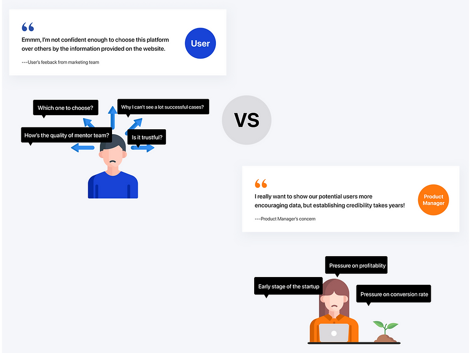
There is a lack of trust between the users and the early startup

-
What I have done
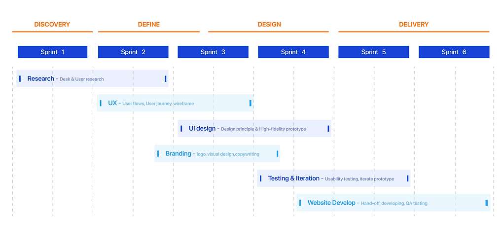
Project timeline and scope of work
-
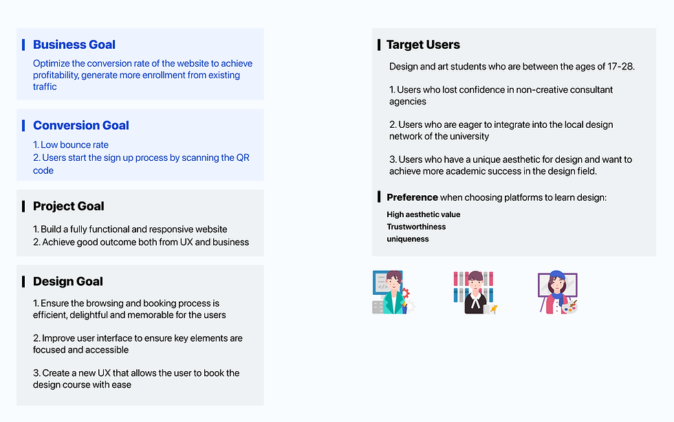
Where I started
Always keep the business and user goals at the forefront of the design process
-
The challenge
Yeah, designer is born to solve problems :)
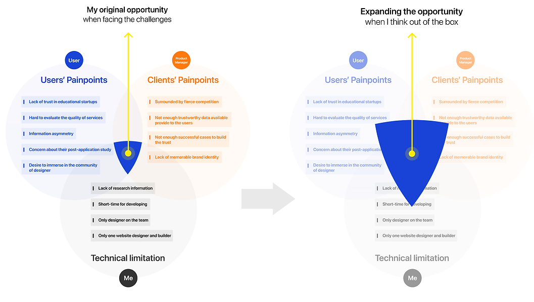
BUT, do we have to rely on successful cases to drive users?
Can we change another way to build user’s trust on the company and increase the conversion rate to achieve a profit?

-
The breakthrough
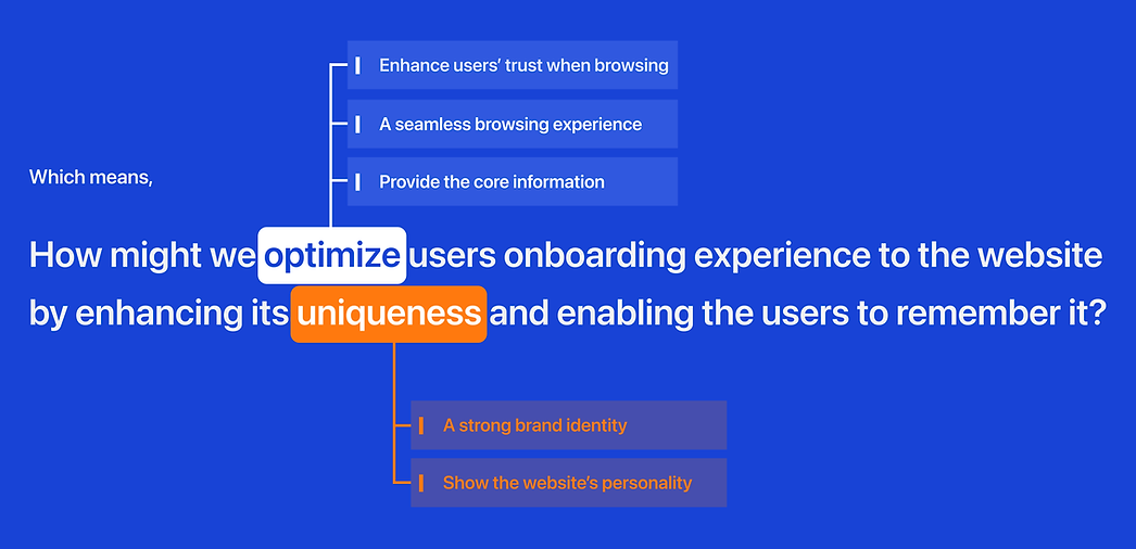
The fact is, visual appeal matters


Data from: 1.web credibility research from Stanford 2. Research from Carlton University
-
So, where is the uniqueness?
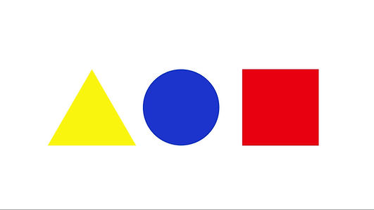
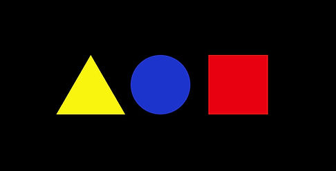
In order to build a strong and unique brand identity, I started to discover the uniqueness of my client.
Because the startup is rooted in the Polytechnic University of Milan, I found inspiration on campus, which provided a unique brand signal.

-
Logo development & brand identity

-
Ideation
Set the design principles and the tone
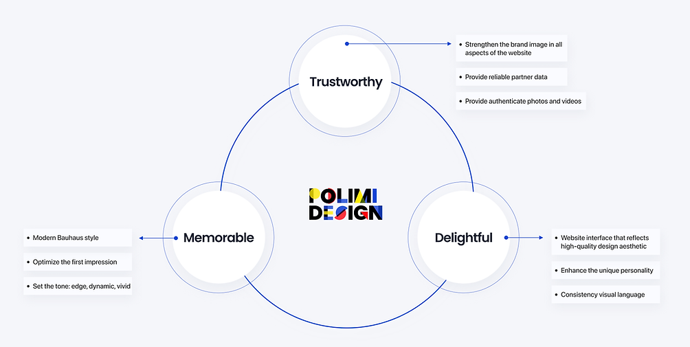
Define the information Architecture
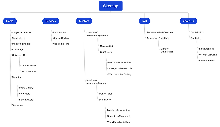
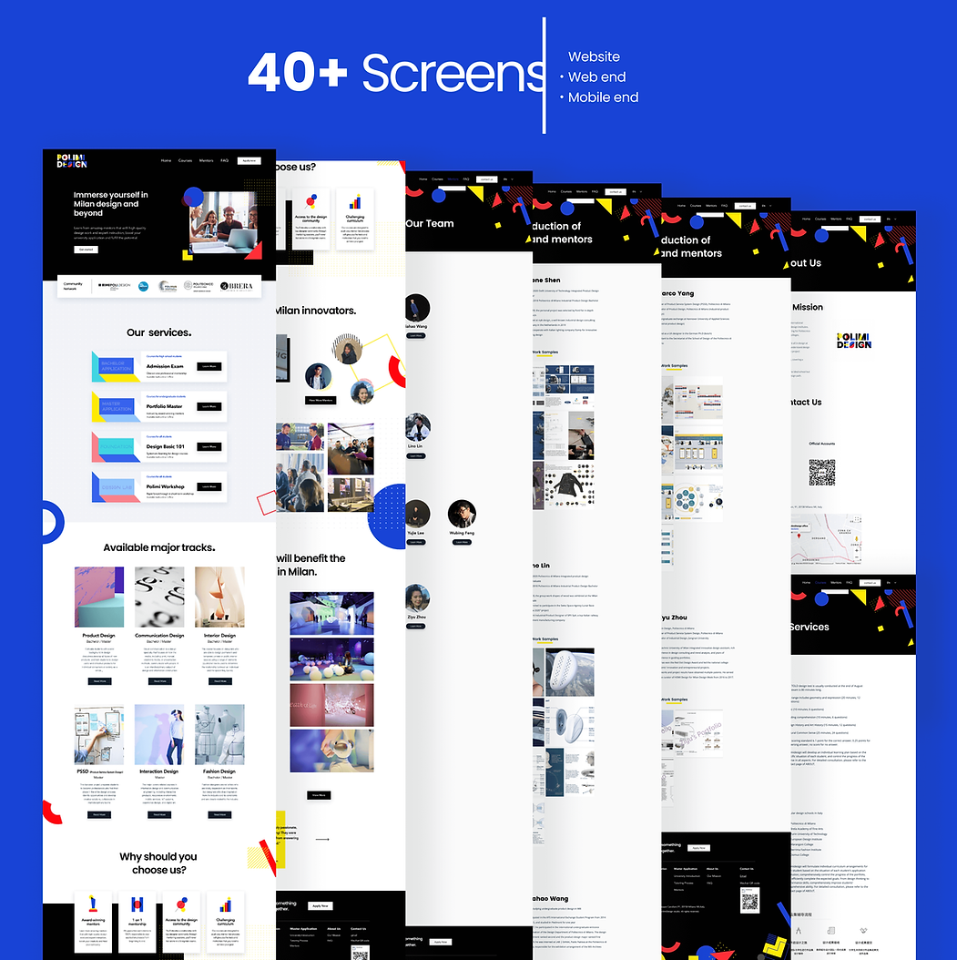
-
Challenges along with the design process
Challenge 1:
How I optimized the conversion of the landing page?
Each web page should be built with a goal for the business as well as delivering on the user’s needs and expectations.
Guide users to stay longer at key conversion nodes
For the footer design, considering here contains some key information that can directly contribute to conversion growth, I use more vivid visual elements attract users and deepening brand impression.
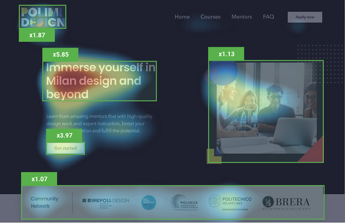
Based on the Attention Map and Areas of Interest (AOI), it pinpoints out the users focal areas in my design.

Challenge 2:
How I ensured users readability among the fancy visual elements?
Besides I use F- Pattern and Z-Pattern to drive user-engagement in a more natural & comfortable scan line,
I still considered following factors:


Visual Hierarchy = Information Prioritization
Based on the golden ratio,
I carefully adjusted the position of the CTA button, important headline and secondary information, tertiary information.
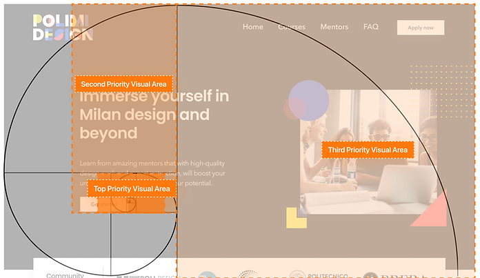
Usability testing results are well verified my design decision. 🎉
Based on the Attention Map
and Areas of Interest (AOI),
it pinpoints out the users focal areas in my design.
The results indicate:
Headline: 585% AOI
CTA button: 397% AOI
-
Website development
Yeah, high-fidelity prototype only completes 50% of the solution, implementation is the other 50%
Since I was the one who charges from designing to implementation, so I have to take the development constraints in advance when I was dealing with wireframe pixels.
Major design decisions that helped me to ship a good performance website:
1. Use a responsive grid system to arrange the layout and visual elements
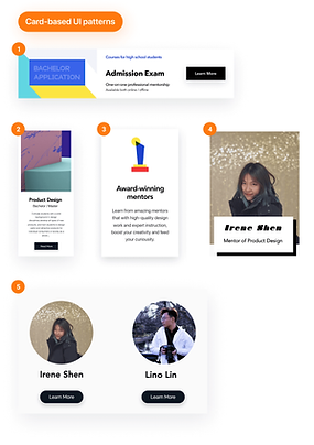
2. Card-based container performs well across several sizes of browsers and devices.
3. Taking translation and localization issues into account, choose fonts that could perform both excellent in English and Chinese, ensure a friction-less website browsing experience and bug-free website performance.


-
Impact overview
How did I measure success?
Overall, the design solution achieved the both design goals and business goal.
Based on the results,
User satisfaction increased ⬆︎;
Clients' revenue increased ⬆︎
The data after launched the website:

Thank you for reading here! 🥰

